 MEMBERSHIP
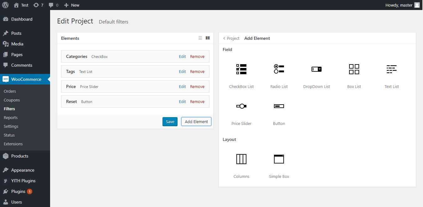
There are two panels in the editor.
- The left side shows a list of elements.
- The right side contains Settings for current element or project settings. By default, right panel contains project settings. To save the project, click Save on elements panel.
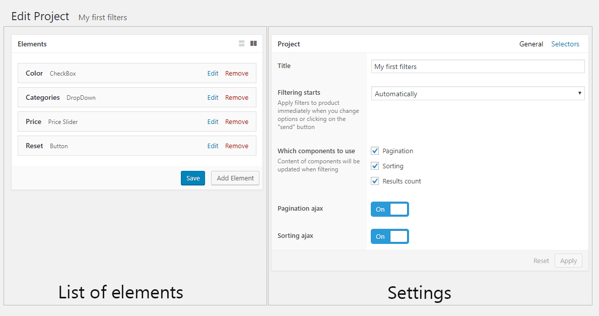
Creating Elements
Click the “Add Element” button. A panel open with a list of elements. The first list is “Field” – here are elements responsible for filtering products. The “Layout” list content layout elements responsible to arrange field elements.
After selecting an element, this element appears on left side panel and, if necessary, settings of this element appears on right side panel.
Setting Up the Project
Field “Title” – name of project that is only visible in the Admin Panel.
Field “Filtering starts” – mode of applying filters to products.
Option “Automatically” – filters are applying immediately when you activate them.
Option “When on click send button” – filters are applying only after clicking on “apply” button. In this case, you need to create a “Button” element and specify “Filter” option in “Action” field.
Field “Which components to use” – content of components will be updated when filtering. For example, if “Pagination” component is enabled, you can turn on ajax pagination.
Field “Pagination ajax” – switch to enable/disable ajax pagination.
Field “Sorting ajax” – switch to enable/disable ajax sorting.
Fields “Products container selector”, “Pagination selector”, “Result count selector”, “Sorting selector”, “Page title selector“ – element selectors on page.
Setting Up Elements
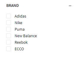
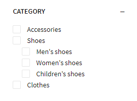
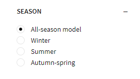
Options for List Element
- Field “Title” – title that will be displayed on top of list. It implements clients with understanding what the element filter.
- When you change filter, an attribute appears in url. Field “URL key” – name of attribute in url or URL-friendly version of element name. For example, field “URL key” value “brands” will appear in url http://my-shop.com/shop/?brands=appel,samsung
- Field “Query type” – query type that allows you to apply multiple filters.
- Option “AND” – show only products that satisfy both conditions set by the user through applied filters (for that particular element).
- Option “OR” – search returns all products that satisfy at least one of the conditions set by the user through applied filters (for that particular element).
- Field “Multi select” – enable/disable multiple selection.
- Field “Source of items” – select source of items for a list that will be using to filter products.
- Option “Attribute” – means product attributes to be displayed (see “Products > Attributes”).
- Option “Category” – means product categories to be displayed (see “Products > Categories”).
- Option “Tag” – means product tags to be displayed (see “Products > Tags”).
- Option “Taxonomy” – means product taxonomy to be displayed. This option can be use when there are plugins extending capabilities of WooCommerce. For example, you have plugin “WooCommerce Brands” installed. With option “Taxonomy” you can display list of brands.
- Field “Attribute” – from which attribute the items will be taken. You can see attributes on “Products > Attributes”.
- Field “Category” – allow to select: show all categories with subcategories or subcategories for one selected category. You can see categories on “Products > Categories”.
- Field “Taxonomy” – from which taxonomy the items will be taken. For example, if you have plugin “WooCommerce Brands” installed, you can set taxonomy of “Brands”.
- Field “Display” – display items mode.
- Option “All” – display all items.
- Option “Only Parent” – display only top-level items, without child sub-items.
- Option “Only Selected” – display only specified items.
- Option “Except selected” – displays all items except selected ones.
- Field “Select items” – items that will be displayed.
- Field “Exclude items” – items that will not be displayed.
- Field “Display hierarchical” – switch to display items as a tree or a list.
- Field “URL value format” – format of value in url attribute.
- Option “ID” – display a unique item number.
- Option “Slug” – output URL-friendly version of item name.
- Field “Show reset item” – display reset value item.
- Field “Title reset item” – title of reset item.
- Field “Display title” – display element title.
- Field “Display toggle content” – display the toggle to hide content.
- Field “Default toggle state” – default state(show/hide).
- Field “CSS Class” – css class for element.
- Field “Action for empty options” – actions with filter items when no available products.
- Field “Display product counts” – show/hide product counts in items.
- Field “Display rules” – under what conditions to show element.
“Display Rules” allows you to create a set of rules that decide when to display an element in filters.
Note that layout rules can be grouped to create any combination of and “and” “or” operators.
1. Rule type
When editing a element, ‘types’ drop down is first dropdown in location rule row.
Here you can specify one of following elements: “Category”, “Attribute”, “Taxonomy”, “Tag”, “Page”.
2. Rule operator
This step is optional and not required for your custom location rule to work. When editing a elment, ‘operators’ drop down is second dropdown in location rule row.
3. Rule value
When editing a element, ‘values’ drop down is the third dropdown in location rule row. This list is dynamically updated based on ‘type’. For example, when chose “Category” in “type” field, categories will appear here.
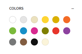
Additional Options for Color List Element
- “Colors” field is used to configure colors. To add a color, click “Add Item” button.
- “Type” field specify method of setting color with a color picker or a picture (for example, camouflage color or black and white dots).
- Fields “Color” and “Image” – color or picture that client will see.
- Field “Value” – value by which products will be filtering.
- Field “Display border” – enable/disable border around item.
- Field “Border color” – color of border around item.
- Field “Marker style” – marker style. For example, if color is white, marker should be dark and vice versa, if color is black, marker should be light.
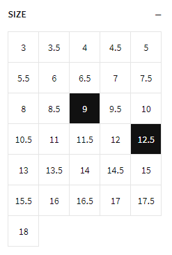
Additional Options for Box List Element
- Field “Box size” – height and width of box item.
Additional Options for Text List Element
- Field “Inline style” – switch to show items inline or one item per line.
Options for Price Slider Element
- Field “Title” – title that will be displayed on top of element. It implements clients with understanding what the element filter.
- Field “URL format” – format of attribute in url.
- Option “Parameters through a dash” – minimum and maximum value will be sent using a dash. For example http://my-shop.com/shop/?price=10-150
- Option “Two parameters” – for minimum and maximum values, a separate url attribute will be created. For example, http://my-shop.com/shop/?min-price=10&max-price=150
- When you change filter, an attribute appears in url. Field “URL key” – name of attribute in url or URL-friendly version of element name. Field “URL key for minimum price” and “URL key for maximum price” – name of attribute of minimum and maximum prices in url.
- Field “Display title” – display element title.
- Field “Display toggle content” – display the toggle to hide content.
- Field “Default toggle state” – default state(shown/hidden).
- Field “CSS Class” – css class for element.
Options for Button Element
- Field “Title” – button text.
- Field “Action” – button action.
- Option “Reset” – reset all applied filters.
- Option “Filter” – apply selected filters to products. This action is necessary when option “When on click send button” is selected in “Filtering starts” field.
- Field “CSS Class” – css class for element.
Options for Simple Box element
- Field “Title” – title that will be displayed on top of element.
- Field “Display toggle content” – display the toggle to hide content.
- Field “Default toggle state” – default state(shown/hidden).
- Field “CSS Class” – css class for element.
Options for column
- Field “Width” – column width can be set in percentage or in pixels.
Filter for Product Archive
To set which project will filter products on an archive page, follow these steps.
- Go to WooCommerce > Setting > Products.
- Click on “Filters” subtab.
- In “Product archive filters” field, select project
- Click “Save changes”
Elements
Checkbox
Radio List
Drop-Down List

Color List
Box List
Text List
Price Slider

Button
Widgets
Widget “Product Filters”
This is the main plugin widget that displays elements from the Filters Project, which you created and specified as the Filter for Project Archive. By interacting with the form elements, the visible products will be filtered.
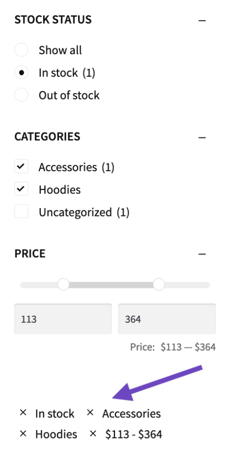
Widget “Notes for Product Filters”
This widget displays a list of options that have been selected, and allows for the quick removal of the filter by clicking the x beside it.
-

Default appearance of Product Filters -
