 MEMBERSHIP
QuadMenu Layouts
We’ve developed the most popular layouts to provide an easy integration into your theme.


Desktop Layouts
Our WordPress Mega Menu allows you to create horizontal & vertical mega menu width accordion or panels with support for touch screens and mobile devices.

Touchscreens
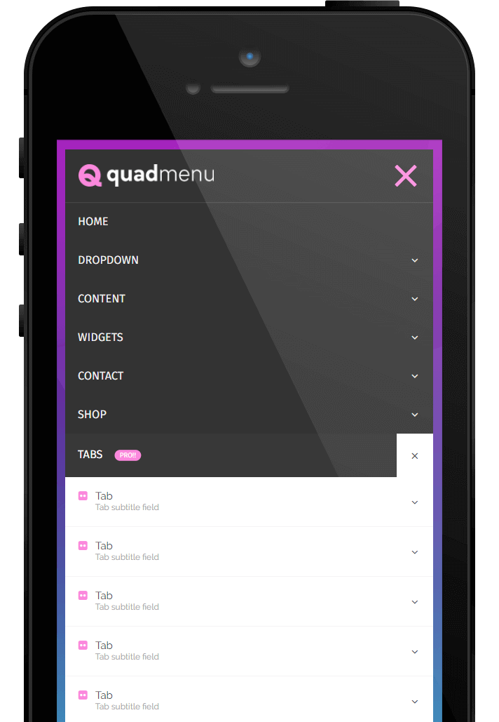
QuadMenu has been developed under the mobile-first concept. The menu responds to all screens and includes a touch interface that improves the user experience.

Developer Features
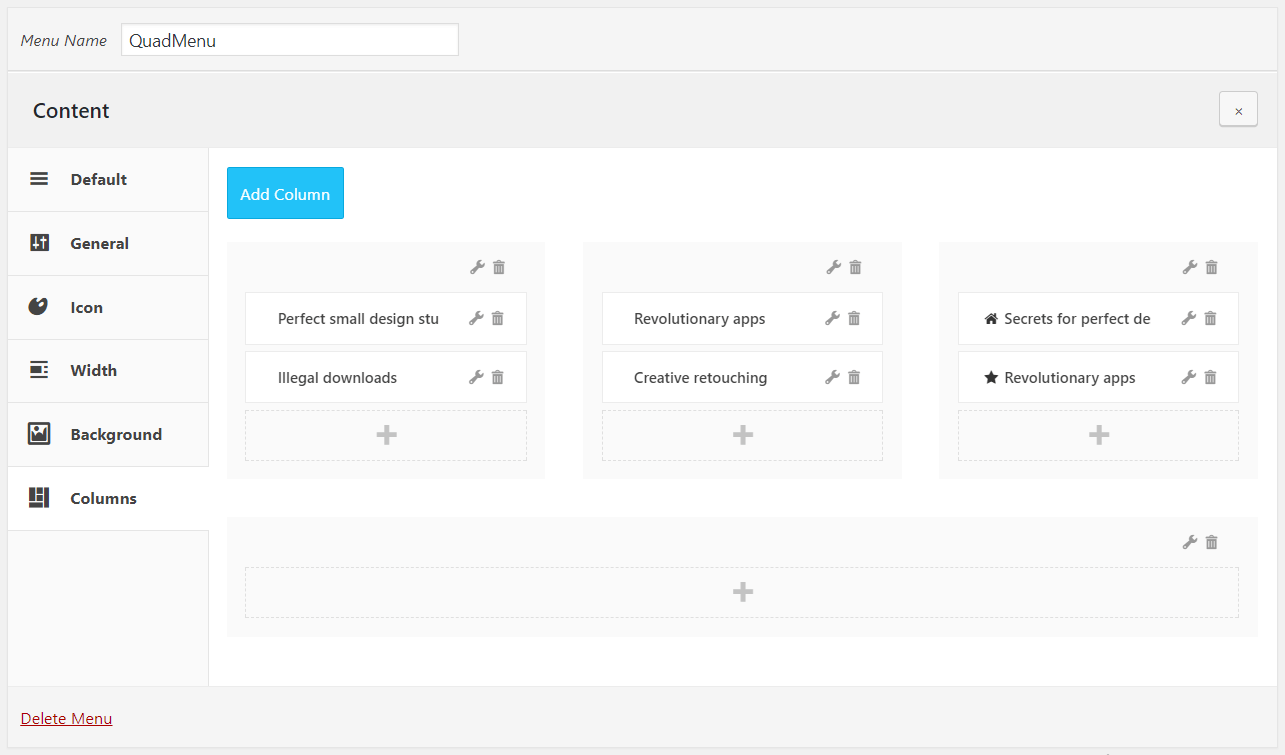
We have included a vast number of filters that let you change the style and behavior of the menu, simplifying the integration with your products.
10000+
Active installs in live sites
5☆
The highest user rating
6hs
Support response time
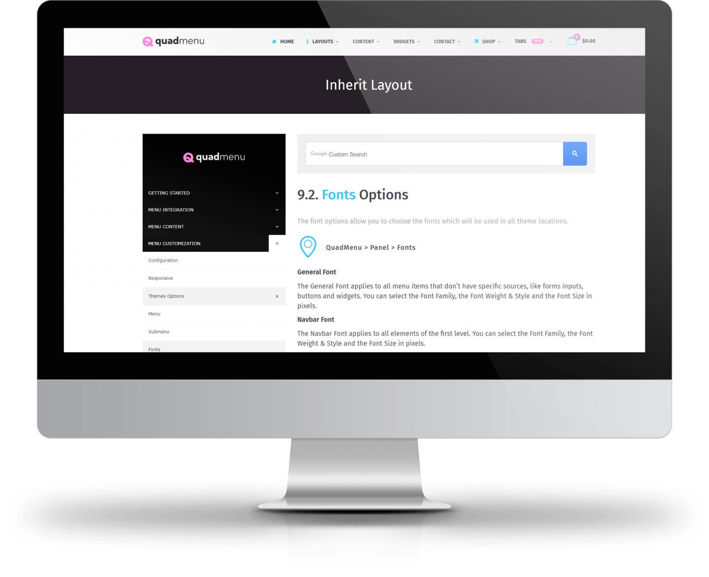
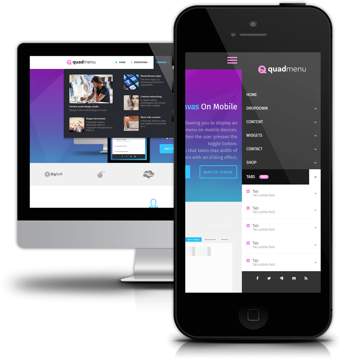
Horizontal & Vertical Menus
Use it to create horizontal & vertical megamenu width accordion or panels
Our WordPress Mega Menu allows you to create horizontal and vertical mega menus. Both with support for touch screens and mobile devices.
Touch interface which improves the user experience
QuadMenu isn’t just a responsive mega menu, it has a touch interface which significantly improves the user experience on these screens.
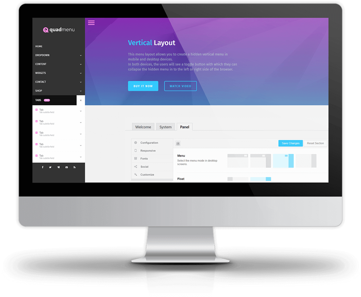
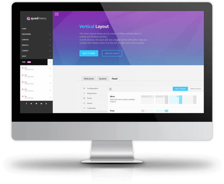
Responsive menu layout
You can choose your own breakpoint to control the viewport width at which the menu collapses.
Caret to close dropdowns menus
When a submenu is opened in a touchscreen, a new close button will be attached to the item.
First click to open dropdowns menus
In touchscreens, the first click made by the user open the
submenu contained within the item.
Second click to open item link
As we said before, when the item has a submenu the first click is used to open the submenu, and the second click is used to open the URL of the item.